Purpose
Give the website a clear point of view.
The About page is not here to repeat product details. It is here to explain the identity of the site, the intention behind its presentation, and the atmosphere the project wants visitors to feel.
Loading MyTinyKicks
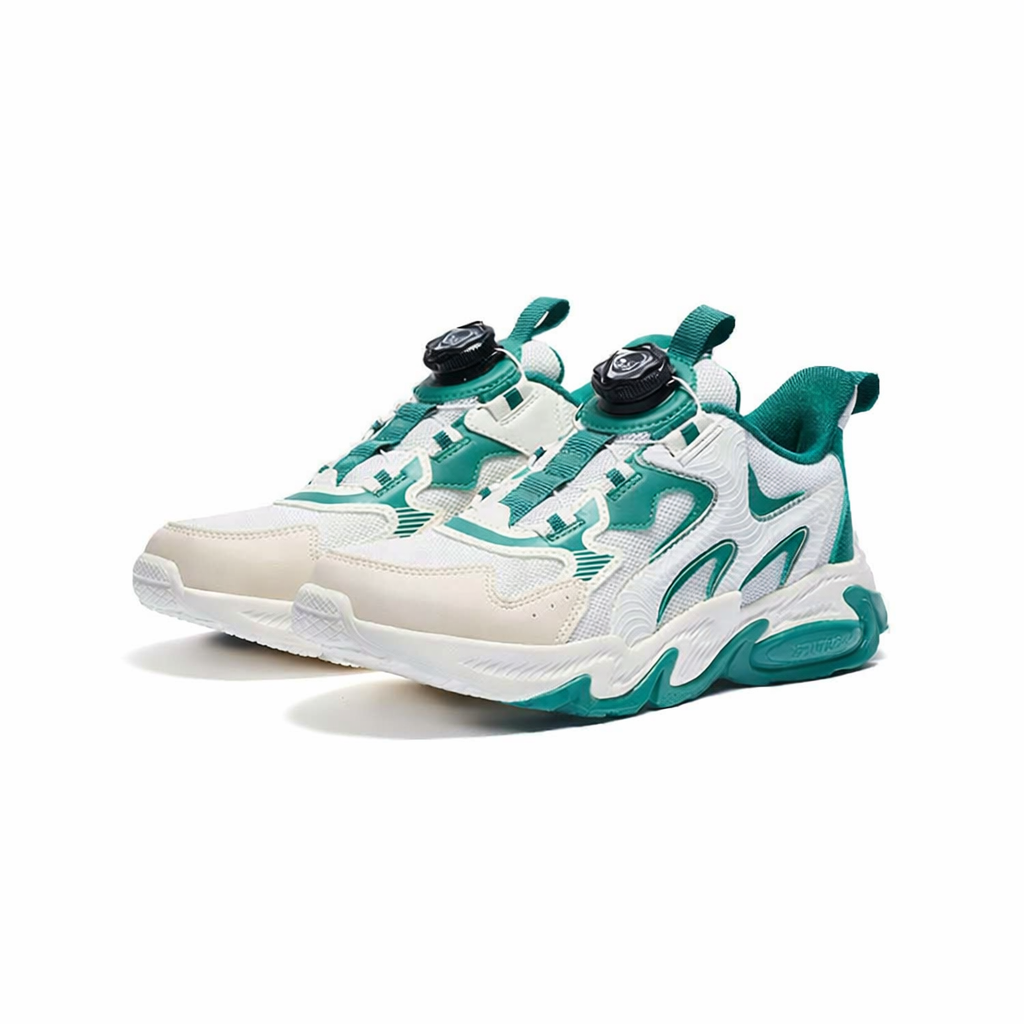
MyTinyKicks was founded in 2025 by miniature sneaker enthusiasts.
This page is meant to explain the website itself: where the idea came from, how the visual language was shaped, and why the experience is designed to feel calm, curated, and personal rather than loud or transactional.
Purpose
The About page is not here to repeat product details. It is here to explain the identity of the site, the intention behind its presentation, and the atmosphere the project wants visitors to feel.
Tone
The design language stays consistent with the homepage: glass surfaces, rounded cards, gradient accents, strong typography, and generous spacing that keeps the story readable.
Position
This site is built to present a personal world, not to push transactions. That difference shapes the writing, the pacing, and the way every page is framed.
MyTinyKicks began as a simple desire to give a personal project a better home on the web. Instead of treating the site as a catalog page or a quick admin panel wrapped in a theme, the goal was to build something that felt composed from the beginning: clean, intentional, and easy to remember after a visitor leaves.
The idea behind the project was never just to place images on a page. It was to create a small digital environment with its own rhythm. That meant choosing a layout that breathes, using typography with enough presence to feel editorial, and shaping the interface so every section feels connected to the same mood. The result is a website that reads more like a visual introduction than a database dump.
A lot of websites in this space move quickly toward clutter: too many labels, too many panels, too many calls to action, too much language that sounds like selling. This project goes in the opposite direction. The homepage introduces the project cleanly, the admin stays practical, and the About page creates room for context. It explains the thinking behind the site so visitors understand the project as a whole rather than seeing only isolated content blocks.
That is also why this About page is intentionally longer. It acts as the narrative layer of the website. It tells people what kind of project they are visiting, what values shaped the design, and why the site presents itself with a certain restraint. In a small website, that kind of clarity matters. It turns a simple web presence into a point of view and gives the project a stronger identity.
What the page should do
Core note
Every page should feel like part of the same story. That means the About page cannot look detached from the homepage. It has to carry the same softness, depth, motion, and spacing while giving visitors more context.
The page below breaks the site story into a few simple steps so visitors can understand the project without needing to guess what it is trying to be.
The project began with the need for a focused online home that could present the website with more care than a typical social post or basic gallery.
Rounded forms, soft gradients, restrained shadows, and bold typography create continuity across the site and keep the experience polished.
The admin exists to keep the content current, while the public pages stay visually clean and focused on the project story.
The About page turns the website from a functional layout into a fuller narrative by explaining the intention behind what visitors are seeing.
A visitor should be able to move from the homepage to the About page and immediately feel that both belong to the same project. That is why this page keeps the same transparent navigation, the same animated entrance, the same indigo-to-purple accents, and the same card system used elsewhere.
Visual consistency is not just decoration. It is a form of trust. When the design language holds together, the website feels more considered, the brand feels more stable, and the content feels more intentional.
The About page uses longer text on purpose. It gives the project room to speak in full sentences, to explain itself carefully, and to make the website feel more complete. That added context makes the rest of the site easier to understand.
Instead of pushing visitors quickly to another action, this page lets them slow down. It creates a more human moment inside the site and gives the project a stronger editorial voice.
The About page is where that story becomes explicit. It gives visitors a reason to stay a little longer, understand the point of view behind the site, and see the project as something made with care rather than simply assembled. That is what this page is for, and that is why it now lives as its own `about.php` page.